


Well, well, there is no hidden truth about how a UX design affects the whole website presentation, so if you have an excellent website presentation, you have good business. But there are always some hit-and-trial rules that help to rock UX designers. Whether you are an amateur or a pioneer in your field, it always hits hard how you are going to represent your things using UX designs.
A design is either a plan or specification for building an object or system or the output of that plan or specification in the form of a prototype, product, or process.
There is some written rule that never goes out of fashion. All you have to do is just follow these rules to create something that you desire.
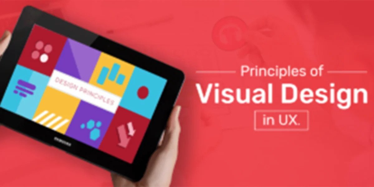
There are 9 best principles of visual designs in Ux that work like a Greek god to attract more audiences and give them the best user experience of their e-portal, so let’s talk about what they are hoping this article will help you to gain a clear vision for UX design projects.
Line shape
This a mere basic but bold statement for any designer like you, You will start with understanding what kind of shape is going to work for your UX design. Having a keen eye for perfect detailing in your design can stand you out in the crowd.
The point, line, and shapes create a combination of your whole design

Color
Well, adding color can be tricky because the human eye can see over 10 million colors over a lifetime.
Color wears a variety of headgear. Color is used in branding to represent mood and perception. Color is viewed by development in terms of SASS and fewer functions. UX design sees color as a uniform system across platforms. Color, in general, is a powerful tool for communicating various forms of information.

Typography
Okay, you got amazing content, but how you present things means which typography you use to represent the whole content that always matters. Many designers interchange the phrases ‘typeface’ and ‘font.’ Those, on the other hand, are not the same thing. A typeface is a type design, whereas a font is a text in a specific size and weight. In a nutshell, a typeface is akin to a family, and fonts are members of that family.

Poster design by Stefanosp for Great American Music Hall
Balance
There is a lot of balance needed in life as well in design, no kidding, well balancing the gradient to the color palette and a lot more to talk about which can exile your design beyond the crowd. Typography, color, images, shapes, patterns, and other design elements all have visual weight. Some components are more prominent and catch the eye, while others are more subtle. The placement of these items on a page should give the impression of balance.

Scale
The use of relative size to convey importance and rank in a composition is referred to as the principle of scale.
To put it another way, when this principle is appropriately used, the most significant aspects of a design are larger than the less important ones. The explanation for this is simple: something that is large is more likely to be noticed.
In most cases, no more than three different sizes are used in a visually appealing design. Having a number of different-sized items not only adds variation to your layout but also establishes a visual hierarchy. Make the most critical aspects of your design the largest to accentuate them.
Grid Alignment
These are supposed to be invisible, but you can see them if you open a book or newspaper, but following a grid will structure your design and make it more enjoyable and easy to consume (no matter what you’re developing.
Even if you’re creating a chaotic design on purpose, there must be some sort of structure to it.
Text alignment is especially crucial; there are various options, but my rule of thumb is to align it to the left. Of course, it depends on what you’re developing and for whom, but most people read from left to right, top to bottom, making text that is the center or right-aligned far more challenging to read.
Contrast
Contrast is another visual design principle. Contrast is typically the best option when you want to indicate that distinct elements belong to various groups. Because contrast makes a clear distinction between them, your user will immediately recognize which parts are related.
Patterns
Patterns also play a vital role in the design of UI. Well, there is a general proportionality that designers use the Z pattern most of the time. Most websites are designed in this way, and the whole design pattern is inclined towards rolling downwards.
A Z-pattern is used by designers for layouts that have less text and more visuals. Viewers scan over the top of the page, then diagonally down to the other corner, using this pattern. The bottom is then scanned in the same manner as the top.
Gestalt
The principle is founded on the assumption that individuals are more likely to see disparate pieces as a whole rather than each one separately. The human brain organizes the images it perceives into something coherent that it can understand. It could, for example, assist you in deciding where to place certain pieces in UX when you’ve previously applied the scale and contrast concepts.
We hope this article will help you to understand more about UX design strategies, if you have any questions or suggestions we would love to hear from you.